
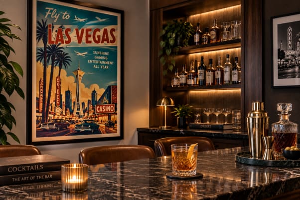
A home bar can turn theatrical quickly. Add too many signs, novelty objects and period references and the room starts to resemble a set. A single vintage Las Vegas poster offers a cleaner route. The best examples already contain enough visual tension: oversized lettering, sharp colour contrasts, stylised buildings and the exaggerated proportions of mid-century commercial graphics.
Against walnut cabinetry, pale stone or a quiet painted wall, one large print can introduce colour and movement without dictating the rest of the room.
Las Vegas was designed to be seen at speed
The city’s mid-century identity developed where architecture and advertising had to catch the eye from a moving car. Roadside signs, hotel façades, entertainment posters and tourism campaigns competed across long sightlines and after dark. Designers responded with scale, simplified forms and lettering that registered almost instantly.
Much of the entertainment those signs advertised has since moved to screens, from streaming to online casino games, but the printed graphics of the era remain tied to streets, buildings and roadside signs.
The Library of Congress places the golden age of illustrated travel posters broadly between the 1920s and 1960s, before photography took a larger role in tourism advertising. Las Vegas suited illustration particularly well. A skyline, roadside sign or stretch of desert could be compressed into a few shapes and still remain recognisable.
Why these posters still work in contemporary rooms
Several styles are often bundled together as “retro” even though they worked differently. Googie architecture favoured sweeping roofs, sharp angles and forms associated with cars, flight and speed. Space Age graphics introduced starbursts, atomic motifs and futuristic lettering. Illuminated signage depended on legibility and hard contrast. Commercial modernism stripped buildings and symbols down to geometry.
That mixture makes the posters easy to place. They can be visually busy yet economical on the page. A turquoise-and-coral print can carry most of a room’s colour, leaving furniture restrained. A tall poster can sharpen a narrow wall; a broad composition can sit over a long drinks cabinet without looking undersized.
Illustration gives these works another advantage. Architecture becomes shape, roads become directional lines and artificial light becomes colour. The image survives even when the viewer knows little about the place depicted.
Original, reissue or reproduction?
“Vintage” is often used loosely. A period original was printed for the original campaign or event. A licensed reissue is produced later with authorisation. A reproduction is a modern copy intended primarily for decoration.
For an original, physical evidence matters more than a seller’s description. Sheet size, printer credits, margins, paper, production marks and restoration history can all help establish what is being offered. Buyers should ask for photographs of the front and back and note fading, folds, trimming, backing or repairs. An implausible format, inconsistent date or conspicuously modern print pattern deserves closer examination.
A reproduction can still be the sensible choice for a working bar area. It carries less conservation risk and can be replaced if damaged, provided it is labelled honestly.
Let the poster do most of the work
The easiest mistake is over-decoration. One substantial print usually has more authority than a grid of small images repeating the same motifs. Over a narrow bar, a vertical work around 45 to 60 centimetres wide can be enough. A larger wall can take one oversized poster or a closely related pair.
Materials should create separation rather than mimic the print. Dark timber gives saturated colour a solid base. Aged brass works with warm reds and yellows. Pale stone keeps dense graphics from making the room feel heavy. Frames are best kept quiet: slim black, brushed metal or medium-toned timber.
Architecture, typography, desert scenes and Space Age imagery tend to age better in an interior than literal gambling symbols. They suggest a period without turning the room into themed décor.
Paper needs protection
An original poster is vulnerable to moisture, heat, direct sunlight and splashes. Conservation guidance recommends stable conditions, low exposure to strong light and acid-free materials.
UV-filtering glazing, reversible mounting and distance from sinks, vents and windows are practical measures. Fragile or historically significant prints deserve specialist framing.
A well-chosen Las Vegas poster already carries enough period character through its typography, colour and architecture. Give it space, protect the paper and let the graphic design carry the room.
Please play responsibly. For more information and advice visit https://www.begambleaware.org
Content is not intended for an audience under 18 years of age



Leave a Comment