Read on
In short, graphic design is spreading a message or a meaning through an art piece. This art piece can be both physical and digital. Some art pieces are viewed differently by different people. Even though you may not consciously think about it, you are engaging with many graphic designs every day. These graphic designs may be websites, landing pages, billboards, logos, billboard, infographics, etc.
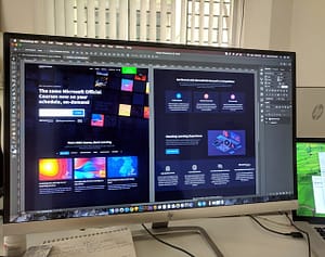
With innovative technology, graphic design potential has been expanding over the years and will continue to expand. For example, if you’re out to pick a photo printer for professional use, the reliable vibrancy and range of colors allow for a singular graphic design to safely cross over from digital into the real world without worrying about undesired deviation. Furthermore, excellent design platforms like Photoshop and others make graphic designing more accessible and in many ways more exciting.
In this article, we’re going over a few graphic design trends reflecting these changes along with some iconic graphic design examples of the past.
More colors with brands
If you think about it, traditional brands of the past like Coca-Cola and Doritos have stuck to the same colors year after year. This is because of the fact that they want to continue to get recognized globally, allowing them to drive more revenue. In 2018, brands are starting to move towards multiple color schemes. We have seen big companies like Google and Apple embrace color and use it to their advantage especially in their advertising. If you go back a few years ago, music giant Spotify rebranded and used this to their advantage. If you want to create a personal brand and a website, I would highly recommend using multiple colors in your design. It allows your audience to see the true you.
Color gradients
We can all remember the rainbow fonts back in the day. The good news is that color gradients are coming back with better style these days. The most common way color gradients are used in design these days is in the background of websites. If you look at Instagram, everything about that app is a color gradient. All in all, it makes what you are looking at feel less plain and more alive.
Bold text
There is nothing better than a bold font that captures your audience’s attention and makes them want to purchase a product. The main slogan that I can think of it Nike’s “Just Do It”, a phrase they have been known for over the years. Another large company that is awesome with this is Adidas. Handwritten fonts are also popular and there are many to choose from with Adobe. Whether it is writing motivational quotes on your Instagram or creating a high-converting landing page, bold text will help capture attention and pinpoint focus for your audience, allowing you to generate more sales and revenue.
Custom illustrations
Like I said earlier, people want to resonate with you and your personal brand. They won’t be able to if you are doing what everyone else in the market is doing, like using stockimages for product labels and not thinking outside the box. One brand that I really have to highlight is Big Baller Brand. The Ball Family has created a unique, custom illustration for each person’s head. You can go on social media and see for yourself. MailChimp and other brands have also used custom illustration to help rebrand themselves. In the end, the customer wants to feel like they have a connection with you, your business, and what you represent. They can’t do that if you are using stock imagery and plain photos.
In the end, these are the most recent graphic design trends that I see popping up in 2018.


Leave a Comment